Buttonの外観を通じて、テンプレートおよびスタイルについて紹介します。
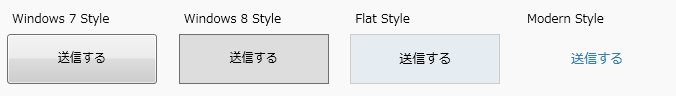
Windows 7 スタイル
WPFがこのお馴染みのスタイルを描画するためには、以下のような要件を適用しています。
- キーボードフォーカス(入力デバイスがキーボードがミソ。マウスじゃないよ)が入ると、ボタンの枠よりマージン2だけ小さい領域に指定した間隔の点線を描画
- 論理フォーカスが入ると、ButtonChromeクラスがゴニョゴニョして、ボタンの後ろ側にあるコンテンツの色がアクセント色になる
- 背景色は上から下に向かい、高さの半分からグラデーションで描画
- マウスがボタンの上にくるとボタンの色がアクセント色になる
- ボタンの上でマウスが押されている状態時に、ボタンの前景色を濃くする
- ボタンの文字は、内部的にContentPresenterに文字を設定しているので、自動でTextBlock化して表示されている
などなどキリがありませんが、これらの要件をXAMLのスタイル上で以下のように表現しています。
1
2
3
4
5
6
7
8
9
10
11
12
13
14
15
16
17
18
19
20
21
22
23
24
25
26
27
28
29
30
31
32
33
34
35
36
37
38
39
40
41
42
43
44
45
46
| <Style x:Key="ButtonFocusVisual">
<Setter Property="Control.Template">
<Setter.Value>
<ControlTemplate>
<Rectangle Margin="2" SnapsToDevicePixels="true" Stroke="{DynamicResource {x:Static SystemColors.ControlTextBrushKey}}" StrokeThickness="1" StrokeDashArray="1 2"/>
</ControlTemplate>
</Setter.Value>
</Setter>
</Style>
<LinearGradientBrush x:Key="ButtonNormalBackground" EndPoint="0,1" StartPoint="0,0">
<GradientStop Color="#F3F3F3" Offset="0"/>
<GradientStop Color="#EBEBEB" Offset="0.5"/>
<GradientStop Color="#DDDDDD" Offset="0.5"/>
<GradientStop Color="#CDCDCD" Offset="1"/>
</LinearGradientBrush>
<SolidColorBrush x:Key="ButtonNormalBorder" Color="#FF707070"/>
<Style x:Key="AeroButtonStyle" TargetType="{x:Type Button}">
<Setter Property="FocusVisualStyle" Value="{StaticResource ButtonFocusVisual}"/>
<Setter Property="Background" Value="{StaticResource ButtonNormalBackground}"/>
<Setter Property="BorderBrush" Value="{StaticResource ButtonNormalBorder}"/>
<Setter Property="BorderThickness" Value="1"/>
<Setter Property="Foreground" Value="{DynamicResource {x:Static SystemColors.ControlTextBrushKey}}"/>
<Setter Property="HorizontalContentAlignment" Value="Center"/>
<Setter Property="VerticalContentAlignment" Value="Center"/>
<Setter Property="Padding" Value="1"/>
<Setter Property="Template">
<Setter.Value>
<ControlTemplate TargetType="{x:Type Button}">
<Themes:ButtonChrome x:Name="Chrome" BorderBrush="{TemplateBinding BorderBrush}" Background="{TemplateBinding Background}" RenderMouseOver="{TemplateBinding IsMouseOver}" RenderPressed="{TemplateBinding IsPressed}" RenderDefaulted="{TemplateBinding IsDefaulted}" SnapsToDevicePixels="true">
<ContentPresenter HorizontalAlignment="{TemplateBinding HorizontalContentAlignment}" Margin="{TemplateBinding Padding}" RecognizesAccessKey="True" SnapsToDevicePixels="{TemplateBinding SnapsToDevicePixels}" VerticalAlignment="{TemplateBinding VerticalContentAlignment}"/>
</Themes:ButtonChrome>
<ControlTemplate.Triggers>
<Trigger Property="IsKeyboardFocused" Value="true">
<Setter Property="RenderDefaulted" TargetName="Chrome" Value="true"/>
</Trigger>
<Trigger Property="ToggleButton.IsChecked" Value="true">
<Setter Property="RenderPressed" TargetName="Chrome" Value="true"/>
</Trigger>
<Trigger Property="IsEnabled" Value="false">
<Setter Property="Foreground" Value="#ADADAD"/>
</Trigger>
</ControlTemplate.Triggers>
</ControlTemplate>
</Setter.Value>
</Setter>
</Style>
|
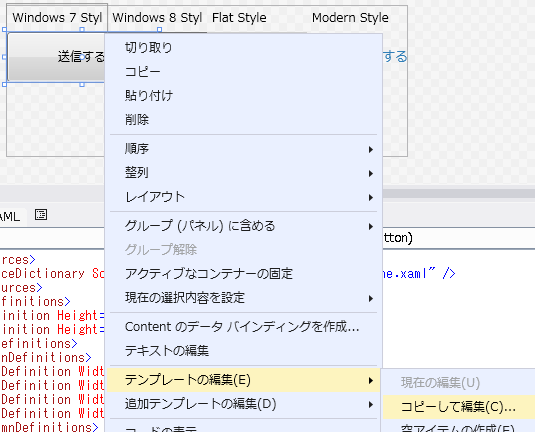
このStyleですが、VisualStudio上で以下のように右クリックで簡単に取得できます。
XAML上に <Button Width="150" Height="50" Content="送信する" x:Name="SampleButton"/> と定義するだけで、内部的にはButton用スタイルが自動で適用されているわけです。
ボタン自体のスタイルは <Style x:Key="AeroButtonStyle" TargetType="{x:Type Button}"> から始まります。
x:Key="AeroButtonStyle" とキー指定している場合は、XAML上で明示的にキーを設定しないと適用されません。
キー指定せずに <Style TargetType="{x:Type Button}"> とStyle定義すると、全てのボタンのスタイルがこれから定義するStyleに自動で従うようになります。
また、 <Style TargetType="{x:Type Button}" BasedOn="{StaticResource {x:Type Button}}"> と、BasedOnを指定することで、元になる定義済みのスタイルを適用した上で任意のスタイルを上書きすることもできます。
<Setter Property="FocusVisualStyle" Value="{StaticResource ButtonFocusVisual}"/>
ですが、TargetTypeが Button で Property名が “FocusVisualStyle” つまり Button.FocusVisualStyle プロパティに対して、Value=で “ButtonFocusVisual” というキー名の値を設定していることを表します。
このキー名に一致するものは、以下のようになっています・
1
2
3
4
5
6
7
8
9
| <Style x:Key="ButtonFocusVisual">
<Setter Property="Control.Template">
<Setter.Value>
<ControlTemplate>
<Rectangle Margin="2" SnapsToDevicePixels="true" Stroke="{DynamicResource {x:Static SystemColors.ControlTextBrushKey}}" StrokeThickness="1" StrokeDashArray="1 2"/>
</ControlTemplate>
</Setter.Value>
</Setter>
</Style>
|
Margin=“2” で StrokeThickness=“1” StrokeDashArray=“1 2”のRectangleを描画していますね。
確かにTabでキーボードフォーカスを入れると、ちょっと小さな枠に点線で四角が描画されていませんか?
WPFが標準で提供する組込みコントロールも、最小限の部品(LabelやTextBlock、Rectangle)を組み合わせて構成されていることがわかります。
なので、これら最小限の部品に対しては、デフォルトでスタイルが適用されるようなことをやってはなりません。
<Style TargetType="{x:Type TextBlock}"> とかすると、TextBlockはいたるところで利用されているので画面がまともに描画されなくなります。
といっても、テキストブロック用のStyleを用意したい場合には <Style x:Key="MyTextBlock" TargetType="{x:Type TextBlock}"> のようにキーを明示的に宣言して、他のコントロールに影響がでないようにします。
次に <Setter Property=" とプロパティ値をカスタマイズしていきますが、この際にスタイルをダイナミックに適用することもできます。
<Setter Property="Background" Value="{DynamicResource MyBackgroundBrush}"/>
DynamicResourceですが、これは要素が実際にテンプレートを必要とする(描画)段階で、キー名で検索して適用します。
StaticResourceが定数としたら、DynamicResourceは書き換え可能な変数というところでしょうか。
アプリケーションはそのブランドイメージに見合う色などがあります。
このブログも今は白とブルーを基調としたイメージカラーになっています。
このようなイメージカラーをたとえば、カラーピッカーなどを利用してアプリケーションの実行中にダイナミックに変更することが可能になります。
テンプレート
Xamlを利用して、様々なStyleを作成していく中で、 <Setter Property="Template"> については、特別な意味があります。
Button.Template プロパティは、このボタンの外観に関する全てを新しく書き換えることを意味します。
Windows7のAeroスタイル例を整理しながら説明します。
1
2
3
4
5
6
7
8
9
| <Setter Property="Template">
<Setter.Value>
<ControlTemplate TargetType="{x:Type Button}">
<Themes:ButtonChrome x:Name="Chrome" BorderBrush="{TemplateBinding BorderBrush}" Background="{TemplateBinding Background}" RenderMouseOver="{TemplateBinding IsMouseOver}" RenderPressed="{TemplateBinding IsPressed}" RenderDefaulted="{TemplateBinding IsDefaulted}" SnapsToDevicePixels="true">
<ContentPresenter HorizontalAlignment="{TemplateBinding HorizontalContentAlignment}" Margin="{TemplateBinding Padding}" RecognizesAccessKey="True" SnapsToDevicePixels="{TemplateBinding SnapsToDevicePixels}" VerticalAlignment="{TemplateBinding VerticalContentAlignment}"/>
</Themes:ButtonChrome>
</ControlTemplate>
</Setter.Value>
</Setter>
|
<ControlTemplate TargetType="{x:Type Button}"> として、Buttonの外観を再定義しています。
その中身は <Themes:ButtonChrome ・・・ として、Microsoft.Windows.Themes.ButtonChrome クラスを指定しています。
仮にココにCheckBoxを指定した場合は、開発者はButtonをXamlに定義しているにもかかわらず、実行してみると画面上にはチェックボックスが表示されることになります。これがテンプレートです。
各種プロパティに設定しているTemplateBindingは、別のコントロール プロパティ値を参照するバインディング機能になります。
ここでは、ButtonChrome.BorderBrushは、ControlTemplateで定義されているButton(つまりもともとのコントロール)のBorderBrush値を参照するように設定されています。
TemplateBinding Binding はより具体的で柔軟な設定を可能とし、例えば2個上の親コンテンツのプロパティ値や、指定した親の型が見つかればその値を利用するなど、カスタム コントロールを作成するレベルでは、とても重宝するバインディング機能の一つです。
WPFはバインディングとテンプレートが肝要と紹介する所以です。
<ContentPresenter ・・・ は Botton.Contentプロパティに設定した”送信する”という表示文字列が、ContentPresenterに設定された結果、前に説明した通りTextBlockとして画面に表示されることになります。
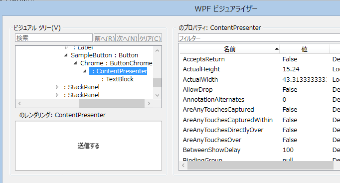
WPFのデバック機能で、ビジュアライザーというものがあります。
これを通して、外観を確認すると、なるほどとなります。
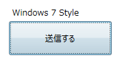
サンプルボタン
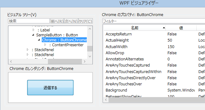
そのテンプレートの最終的なContentPresenter
次に、先ほどは省略しましたが ControlTemplate に、ControlTemplate.Triggers プロパティ値を設定していたと思います。
1
2
3
4
5
6
7
8
9
10
11
| <ControlTemplate.Triggers>
<Trigger Property="IsKeyboardFocused" Value="true">
<Setter Property="RenderDefaulted" TargetName="Chrome" Value="true"/>
</Trigger>
<Trigger Property="ToggleButton.IsChecked" Value="true">
<Setter Property="RenderPressed" TargetName="Chrome" Value="true"/>
</Trigger>
<Trigger Property="IsEnabled" Value="false">
<Setter Property="Foreground" Value="#ADADAD"/>
</Trigger>
</ControlTemplate.Triggers>
|
これがXAMLが単なるデータ記述言語よりも優れていて、なんらかのイベント トリガーをキーに動的にプロパティ値を変更することができる技術になります。
キーボードフォーカスを受け取ったときや、非活性時にはそれに見合ったスタイルを動的に適用することができます。
こういった様々なXAML上の技術が適用されてWindows7のAeroスタイルが適用されていますが、ここで考えたいのが
“What is the difference between art and design?”(デザインとアートの違いとは何か?)
”Design solves a problem, art is expression”(デザインとは問題解決であり、アートとは自己表現である。)
Why?をBecauseで説明出来なければ、それは明らかにデザインではない
です。
これを素で開発するとした場合は、開発者には高い技術力を求め、OSもこれを描画するための高いコストを支払います。
果たして、これに対して Because を説明できるでしょうか?
そうした結果が、Windows8 Styleや Flat Ftyleにつながりますが、果たしてまだ最適化はできないものでしょうか?
Windows8 Style
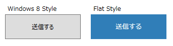
Flat Styleはボタンを押下すると、ブランド カラー が表示されています。
どちらも、無駄なグラデーションなどはなくなりました。
Windows 8 で、同じようにXaml上で右クリック-テンプレートの編集から、適用されているXAMLのスタイルが簡単にコピーできます。
1
2
3
4
5
6
7
8
9
10
11
12
13
14
15
16
17
18
19
20
21
22
23
24
25
26
27
28
29
30
31
32
33
34
35
36
37
38
39
40
41
42
43
44
45
46
47
48
49
50
51
52
53
54
55
56
| <Style x:Key="FlatButtonStyle" TargetType="{x:Type Button}">
<!-- アプリケーションで統一的なフォント、サイズなどをダイナミックに適用 -->
<Setter Property="Foreground" Value="{DynamicResource AppForeground}"/>
<Setter Property="FontFamily" Value="{DynamicResource AppFont}"/>
<Setter Property="FontSize" Value="{DynamicResource AppFontSize}"/>
<!-- ボタン特有のスタイル -->
<Setter Property="Background" Value="{DynamicResource ButtonBackground}"/>
<Setter Property="BorderBrush" Value="{DynamicResource ButtonBorder}"/>
<Setter Property="FocusVisualStyle" Value="{x:Null}"/>
<Setter Property="BorderThickness" Value="1,1,1,1"/>
<Setter Property="HorizontalContentAlignment" Value="Center"/>
<Setter Property="VerticalContentAlignment" Value="Center"/>
<Setter Property="Template">
<Setter.Value>
<ControlTemplate TargetType="{x:Type Button}">
<Border x:Name="border"
BorderBrush="{TemplateBinding BorderBrush}"
BorderThickness="{TemplateBinding BorderThickness}"
Background="{TemplateBinding Background}"
SnapsToDevicePixels="True">
<ContentPresenter x:Name="contentPresenter"
ContentTemplate="{TemplateBinding ContentTemplate}"
Content="{TemplateBinding Content}"
ContentStringFormat="{TemplateBinding ContentStringFormat}"
Focusable="False"
HorizontalAlignment="{TemplateBinding HorizontalContentAlignment}"
Margin="{TemplateBinding Padding}"
RecognizesAccessKey="True"
SnapsToDevicePixels="{TemplateBinding SnapsToDevicePixels}"
VerticalAlignment="{TemplateBinding VerticalContentAlignment}"/>
</Border>
<ControlTemplate.Triggers>
<Trigger Property="IsEnabled" Value="false">
<Setter Property="Foreground" Value="{DynamicResource AppForegroundDisabled}"/>
<Setter Property="Background" Value="{DynamicResource AppDisabled}"/>
</Trigger>
<Trigger Property="IsMouseOver" Value="True">
<Setter Property="Background" Value="{DynamicResource ButtonBackgroundHover}" />
<Setter Property="BorderBrush" Value="{DynamicResource ButtonBorderHover}"/>
<Setter Property="Foreground" Value="{DynamicResource ButtonTextHover}"/>
</Trigger>
<Trigger Property="IsPressed" Value="True">
<Setter Property="Background" Value="{DynamicResource ButtonBackgroundPressed}" />
<Setter Property="BorderBrush" Value="{DynamicResource ButtonBorderPressed}"/>
<Setter Property="Foreground" Value="{DynamicResource ButtonTextPressed}"/>
</Trigger>
<Trigger Property="IsFocused" Value="true">
<Setter TargetName="border" Property="BorderBrush" Value="{DynamicResource AppBrand}" />
</Trigger>
</ControlTemplate.Triggers>
</ControlTemplate>
</Setter.Value>
</Setter>
</Style>
|
Wibndows 7 のAeroスタイルよりもまだ描画コストは減りましたが、あんまり変わりませんね。
もっと、最適化できないか?削れないか?本当にそれは必要か?と考えた際にたどり着くのがModern Styleになります。
Modern Style
もはやボタン枠すらもありませんが、確かにユーザーはそれを押下できるコンテンツと認識でき、何が起こるかを理解できます。
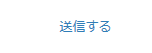
こうなると、XAML上のスタイルも簡単で、OSもこれを描画するためにコストはかけません。
かといって、ユーザーがこれを退屈なコンテンツと認識するかといえば、とてもモダンな雰囲気を受けます。
1
2
3
4
5
6
7
8
9
10
11
12
13
14
15
16
17
18
19
20
21
22
23
24
25
26
27
28
29
30
31
| <Style x:Key="ModernButtonStyle" TargetType="{x:Type Button}" >
<Setter Property="Foreground" Value="{DynamicResource AppBrand}" />
<Setter Property="FontFamily" Value="{DynamicResource AppFont}"/>
<Setter Property="FontSize" Value="{DynamicResource AppFontSize}"/>
<Setter Property="FocusVisualStyle" Value="{x:Null}"/>
<Setter Property="HorizontalContentAlignment" Value="Center"/>
<Setter Property="VerticalContentAlignment" Value="Center"/>
<Setter Property="Focusable" Value="False" />
<Setter Property="Template">
<Setter.Value>
<ControlTemplate TargetType="Button">
<TextBlock Name="chrome"
HorizontalAlignment="{TemplateBinding HorizontalContentAlignment}"
VerticalAlignment="{TemplateBinding VerticalContentAlignment}">
<ContentPresenter />
</TextBlock>
<ControlTemplate.Triggers>
<Trigger Property="IsMouseOver" Value="true">
<Setter TargetName="chrome" Property="TextBlock.TextDecorations" Value="Underline" />
</Trigger>
</ControlTemplate.Triggers>
</ControlTemplate>
</Setter.Value>
</Setter>
<Style.Triggers>
<Trigger Property="IsEnabled" Value="false">
<Setter Property="Foreground" Value="{DynamicResource AppForegroundDisabled}"/>
</Trigger>
</Style.Triggers>
</Style>
|
もはやスタイルは必要最低限で、しかしマウスが乗るとそれが実行可能なコンテンツであることを即座に理解できます。

ブランドカラーをカスタマイズもできます。
しかも、これはアプリケーション ポリシーのようなもので、開発者はただ単にXaml上でButtonと定義しただけにもかかわらず、自動的にこのスタイルが適用されることになります。
LOB開発が、モダンで先進的なWebデザインに一矢報いることも夢ではありません。
いつものごとく、サンプル成果物はGit管理で。
@s-ueno/uENLab on GitHub