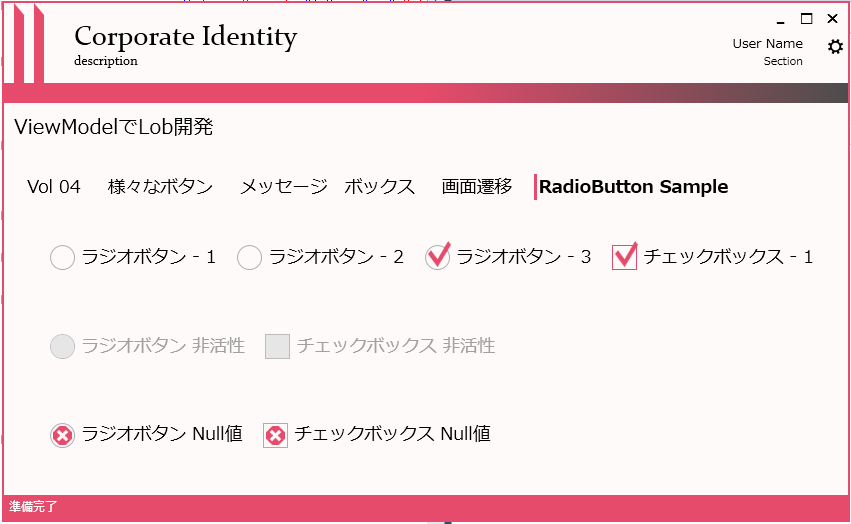
CheckBox と RadioButton の Style を カスタマイズします。
CheckBox と RadioButton ですが その挙動に関しては異なりますが、外観に関しては
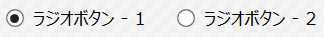
Checked、Unchecked、Null の三つの状態とテキストをユーザーに表示するという点で
同じように取り扱えます。
そのため Style に関しては ToggleButton というベースクラスにキー名を設定して
作成することも可能です。
まずは、前回と同様に土台を取得するため VisualStudio のデザイナ上で
ChekBox( もしくは RadioButton ) を右クリック ⇒ テンプレートの編集 ⇒ コピーして編集で生成される
テンプレートを利用したいと思います。
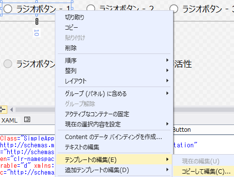
ちなみに FocusVisual は {x:null} で未設定とするので生成されるテンプレートからは外します。
生成されたのがコレです。
1
2
3
4
5
6
7
8
9
10
11
12
13
14
15
16
17
18
19
20
21
22
23
24
25
26
27
28
29
30
31
32
33
34
35
36
37
38
39
40
41
42
43
44
45
46
47
48
49
50
51
52
53
54
55
56
57
58
59
60
61
62
63
64
| <SolidColorBrush x:Key="RadioButton.Static.Background" Color="#FFFFFFFF"/>
<SolidColorBrush x:Key="RadioButton.Static.Border" Color="#FF707070"/>
<SolidColorBrush x:Key="RadioButton.MouseOver.Background" Color="#FFF3F9FF"/>
<SolidColorBrush x:Key="RadioButton.MouseOver.Border" Color="#FF5593FF"/>
<SolidColorBrush x:Key="RadioButton.MouseOver.Glyph" Color="#FF212121"/>
<SolidColorBrush x:Key="RadioButton.Disabled.Background" Color="#FFE6E6E6"/>
<SolidColorBrush x:Key="RadioButton.Disabled.Border" Color="#FFBCBCBC"/>
<SolidColorBrush x:Key="RadioButton.Disabled.Glyph" Color="#FF707070"/>
<SolidColorBrush x:Key="RadioButton.Pressed.Background" Color="#FFD9ECFF"/>
<SolidColorBrush x:Key="RadioButton.Pressed.Border" Color="#FF3C77DD"/>
<SolidColorBrush x:Key="RadioButton.Pressed.Glyph" Color="#FF212121"/>
<SolidColorBrush x:Key="RadioButton.Static.Glyph" Color="#FF212121"/>
<Style TargetType="{x:Type RadioButton}">
<Setter Property="FocusVisualStyle" Value="{x:null}"/>
<Setter Property="Background" Value="{StaticResource RadioButton.Static.Background}"/>
<Setter Property="BorderBrush" Value="{StaticResource RadioButton.Static.Border}"/>
<Setter Property="Foreground" Value="{DynamicResource {x:Static SystemColors.ControlTextBrushKey}}"/>
<Setter Property="BorderThickness" Value="1"/>
<Setter Property="Template">
<Setter.Value>
<ControlTemplate TargetType="{x:Type RadioButton}">
<Grid x:Name="templateRoot" Background="Transparent" SnapsToDevicePixels="True">
<Grid.ColumnDefinitions>
<ColumnDefinition Width="Auto"/>
<ColumnDefinition Width="*"/>
</Grid.ColumnDefinitions>
<Border x:Name="radioButtonBorder" BorderBrush="{TemplateBinding BorderBrush}" BorderThickness="{TemplateBinding BorderThickness}" Background="{TemplateBinding Background}" CornerRadius="100" HorizontalAlignment="{TemplateBinding HorizontalContentAlignment}" Margin="1,1,2,1" VerticalAlignment="{TemplateBinding VerticalContentAlignment}">
<Grid x:Name="markGrid" Margin="2">
<Ellipse x:Name="optionMark" Fill="{StaticResource RadioButton.Static.Glyph}" MinWidth="6" MinHeight="6" Opacity="0"/>
</Grid>
</Border>
<ContentPresenter x:Name="contentPresenter" Grid.Column="1" Focusable="False" HorizontalAlignment="{TemplateBinding HorizontalContentAlignment}" Margin="{TemplateBinding Padding}" RecognizesAccessKey="True" SnapsToDevicePixels="{TemplateBinding SnapsToDevicePixels}" VerticalAlignment="{TemplateBinding VerticalContentAlignment}"/>
</Grid>
<ControlTemplate.Triggers>
<Trigger Property="HasContent" Value="true">
<Setter Property="FocusVisualStyle" Value="{StaticResource OptionMarkFocusVisual}"/>
<Setter Property="Padding" Value="4,-1,0,0"/>
</Trigger>
<Trigger Property="IsMouseOver" Value="true">
<Setter Property="Background" TargetName="radioButtonBorder" Value="{StaticResource RadioButton.MouseOver.Background}"/>
<Setter Property="BorderBrush" TargetName="radioButtonBorder" Value="{StaticResource RadioButton.MouseOver.Border}"/>
<Setter Property="Fill" TargetName="optionMark" Value="{StaticResource RadioButton.MouseOver.Glyph}"/>
</Trigger>
<Trigger Property="IsEnabled" Value="false">
<Setter Property="Background" TargetName="radioButtonBorder" Value="{StaticResource RadioButton.Disabled.Background}"/>
<Setter Property="BorderBrush" TargetName="radioButtonBorder" Value="{StaticResource RadioButton.Disabled.Border}"/>
<Setter Property="Fill" TargetName="optionMark" Value="{StaticResource RadioButton.Disabled.Glyph}"/>
</Trigger>
<Trigger Property="IsPressed" Value="true">
<Setter Property="Background" TargetName="radioButtonBorder" Value="{StaticResource RadioButton.Pressed.Background}"/>
<Setter Property="BorderBrush" TargetName="radioButtonBorder" Value="{StaticResource RadioButton.Pressed.Border}"/>
<Setter Property="Fill" TargetName="optionMark" Value="{StaticResource RadioButton.Pressed.Glyph}"/>
</Trigger>
<Trigger Property="IsChecked" Value="true">
<Setter Property="Opacity" TargetName="optionMark" Value="1"/>
</Trigger>
<Trigger Property="IsChecked" Value="{x:Null}">
<Setter Property="Opacity" TargetName="optionMark" Value="0.56"/>
</Trigger>
</ControlTemplate.Triggers>
</ControlTemplate>
</Setter.Value>
</Setter>
</Style>
|
これをカスタマイズの元にして、最初に TargetType=“{x:Type ToggleButton}” とし
CheckBox と RadioButton のベースのスタイルとして宣言します。
また、お決まりの Background や Foreground を DynamicResource に変更します。
次に生成されたテンプレートを見ると
1
2
3
4
| <Grid.ColumnDefinitions>
<ColumnDefinition Width="Auto"/>
<ColumnDefinition Width="*"/>
</Grid.ColumnDefinitions>
|
として、左側列にチェックマーク、右側列に可変のテキストエリアを用意しているのがわかります。
今回は、RadioButton をベースクラスに利用しましたが、中身をみると Border の CornerRadius=“100”
として丸い境界を宣言し、さらにその中に <Ellipse で 少し小さい丸を描いているのが
わかります。
たしかに、そんな外観をしています。
チェックボックスだと、この角丸がなくなって四角になっているだけです。
このままだと可愛げがないので、こんな形で
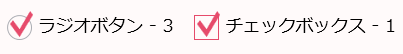
赤ペン先生みたいなアイコン(Designed by Alex Peattie )をチェックマークに
使ってみたいと思います。
このとき普通に四角の中にジオメトリを描画するのではなく Margin="2,-5,-2,2" で
四角の枠から右上にはみ出すようにすると、それっぽくなります。
そんなこんなで、ToggleButton用のStyle は以下のようになりました。
1
2
3
4
5
6
7
8
9
10
11
12
13
14
15
16
17
18
19
20
21
22
23
24
25
26
27
28
29
30
31
32
33
34
35
36
37
38
39
40
41
42
43
44
45
46
47
48
49
50
51
52
53
54
55
56
57
58
59
60
61
62
63
64
65
66
67
68
69
70
71
72
73
74
75
76
77
78
79
80
81
| <Style x:Key="ToggleButtonBase" TargetType="{x:Type ToggleButton}">
<Setter Property="Background" Value="Transparent"/>
<Setter Property="Foreground" Value="{DynamicResource AppForeground}"/>
<Setter Property="BorderBrush" Value="{DynamicResource ToggleButton.Static.Border}"/>
<Setter Property="BorderThickness" Value="1"/>
<Setter Property="FocusVisualStyle" Value="{x:Null}"/>
<Setter Property="Template">
<Setter.Value>
<ControlTemplate TargetType="{x:Type ToggleButton}">
<Grid x:Name="templateRoot" Background="Transparent" SnapsToDevicePixels="True">
<Grid.ColumnDefinitions>
    <ColumnDefinition Width="Auto"/>
    <ColumnDefinition Width="*"/>
</Grid.ColumnDefinitions>
<Border x:Name="PART_Border"
Width="25" Height="25"
CornerRadius="{TemplateBinding Border.CornerRadius}"
BorderBrush="{TemplateBinding BorderBrush}"
BorderThickness="{TemplateBinding BorderThickness}"
Background="{TemplateBinding Background}"
HorizontalAlignment="{TemplateBinding HorizontalContentAlignment}"
Margin="1,1,2,1"
VerticalAlignment="{TemplateBinding VerticalContentAlignment}">
<Grid>
<Viewbox Stretch="Fill" Margin="2,-5,-2,2">
<Path Style="{DynamicResource PathButtonStyle}" x:Name="optionMark"
Fill="{DynamicResource ToggleButton.Static.Glyph}"
Opacity="0"
Data="F1 M 23.7501,33.25L 34.8334,44.3333L 52.2499,22.1668L 56.9999,26.9168L 34.8334,53.8333L 19.0001,38L 23.7501,33.25 Z " />
</Viewbox>
<Viewbox Stretch="Fill" Margin="2">
<Path Style="{DynamicResource PathButtonStyle}" x:Name="optionNullMark"
Fill="{DynamicResource ToggleButton.Static.Glyph}"
Opacity="0"
Data="F1 M 31.6667,19L 44.3333,19L 57,31.6667L 57,44.3333L 44.3333,57L 31.6667,57L 19,44.3333L 19,31.6667L 31.6667,19 Z M 26.4762,45.0454L 30.9546,49.5238L 38,42.4783L 45.0454,49.5238L 49.5237,45.0454L 42.4783,38L 49.5238,30.9546L 45.0454,26.4763L 38,33.5217L 30.9546,26.4762L 26.4762,30.9546L 33.5217,38L 26.4762,45.0454 Z " />
</Viewbox>
</Grid>
</Border>
<ContentPresenter x:Name="contentPresenter" Grid.Column="1" Focusable="False" RecognizesAccessKey="True"
ContentTemplate="{TemplateBinding ContentTemplate}"
Content="{TemplateBinding Content}"
ContentStringFormat="{TemplateBinding ContentStringFormat}"
HorizontalAlignment="{TemplateBinding HorizontalContentAlignment}"
VerticalAlignment="{TemplateBinding VerticalContentAlignment}"
Margin="{TemplateBinding Padding}"
SnapsToDevicePixels="{TemplateBinding SnapsToDevicePixels}"
/>
</Grid>
<ControlTemplate.Triggers>
<Trigger Property="HasContent" Value="true">
<Setter Property="Padding" Value="4,-1,0,0"/>
</Trigger>
<Trigger Property="IsMouseOver" Value="true">
<Setter Property="Background" TargetName="PART_Border" Value="{DynamicResource ToggleButton.MouseOver.Background}"/>
<Setter Property="BorderBrush" TargetName="PART_Border" Value="{DynamicResource ToggleButton.MouseOver.Border}"/>
</Trigger>
<Trigger Property="IsEnabled" Value="false">
<Setter Property="Background" TargetName="PART_Border" Value="{DynamicResource ToggleButton.Disabled.Background}"/>
<Setter Property="BorderBrush" TargetName="PART_Border" Value="{DynamicResource ToggleButton.Disabled.Border}"/>
<Setter Property="Foreground" Value="{DynamicResource ToggleButton.Disabled.Foreground}"/>
<Setter Property="Fill" TargetName="optionMark" Value="{DynamicResource ToggleButton.Disabled.Glyph}"/>
</Trigger>
<Trigger Property="IsPressed" Value="true">
<Setter Property="Background" TargetName="PART_Border" Value="{DynamicResource ToggleButton.Pressed.Background}"/>
<Setter Property="BorderBrush" TargetName="PART_Border" Value="{DynamicResource ToggleButton.Pressed.Border}"/>
<Setter Property="Opacity" TargetName="optionMark" Value="0.2"/>
</Trigger>
<Trigger Property="IsChecked" Value="true">
<Setter Property="Opacity" TargetName="optionMark" Value="1"/>
</Trigger>
<Trigger Property="IsChecked" Value="{x:Null}">
<Setter Property="Opacity" TargetName="optionNullMark" Value="1"/>
</Trigger>
<Trigger Property="IsFocused" Value="true">
<Setter Property="BorderBrush" TargetName="PART_Border" Value="{DynamicResource ToggleButton.Focus.Border}" />
</Trigger>
</ControlTemplate.Triggers>
</ControlTemplate>
</Setter.Value>
</Setter>
</Style>
|
面白いのが RadioButton と CheckBox の外観に関しては
RadioButtonの場合だけ、角を丸く円のようにするだけの差しかなくてもソレっぽくなるところです。
1
2
3
4
| <Style TargetType="{x:Type CheckBox}" BasedOn="{StaticResource ToggleButtonBase}" />
<Style TargetType="{x:Type RadioButton}" BasedOn="{StaticResource ToggleButtonBase}" >
<Setter Property="Border.CornerRadius" Value="45" />
</Style>
|
そこをあえて、まったく異なるスタイルにして、スイッチみたいなデザインを
採用してみるのも面白いかもしれません。